Data
Where there is ‘data smoke’ there is ‘business fire’ (Thomas Redman, aka ‘the data doc’)
Clarity in the presentation, design and visual communication of data to stakeholders is vital. This is even more so in times of uncertainty and change.
In addition, the Board and leadership teams will be unable to make critical decisions without reliable data and information they can trust and understand.

Above all, we believe that the design and visual communication of information and data that is presented to stakeholders should always be like Good King Wenscelas’ snow – Deep, Crisp and Even.
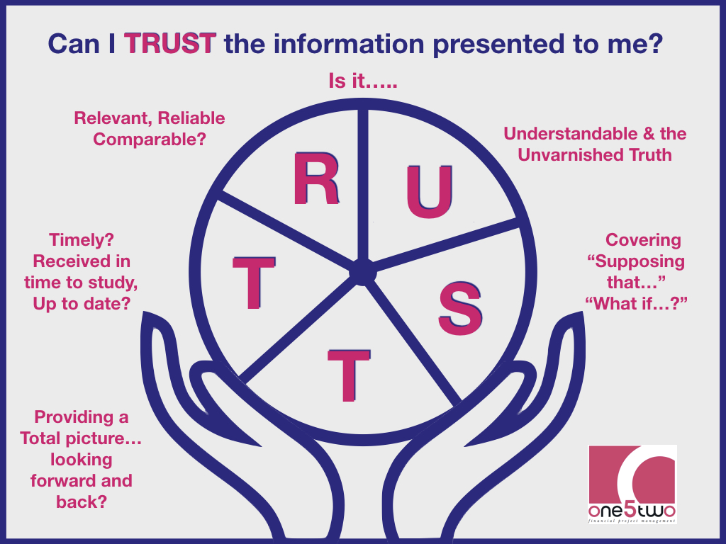
Timely – up to date and received in good time for the user to consider;
Relevant, reliable and comparable. In other words, we compare apples with apples, pears with pears, in context without misleading comparisons on complex pie charts and graphs.
Understandable – easy to follow with the Unvarnished Truth with no hidden issues.
Supposing that…., what if….. We cover the impact of risks and sensitivities so that everyone can understand the impact of potential downsides as well as the optimistic angle.
Total picture – looking forward and back allowing users to consider how the trends of the past could impact on the hopes of the future.
Therefore we help:
Finance teams to clarify their thinking and improve their presentations to stakeholders.
New Board members without a finance background to build confidence in the questions to ask to understand the finance papers.
Teams to structure their finance presentations to aid understanding – no ‘death by powerpoint’ or volumes of charts and lines.
As a result, we use the combined skills and experience of our financial backgrounds and visual communication and design skills to help you improve the clarity of your reporting.
Above all, we believe in simplicity, honesty and clarity in reporting to our Boards and decision makers.
Say what it is and explain what you mean